7 Tips For an Effective Price Table Design (+ Examples)
When a customer is at checkout, it’s a high-stakes moment for everyone. They’re at the point of purchase, and you’re about to make the sale. That’s why effective pricing tables are so important.
Pricing tables can help you increase conversions and maximize revenue by creating a clear, organized way for customers to select the product or service that best fits their needs.
In this post, we’re going to spill the beans on how to create high-performance pricing tables that’ll have your customers reaching for their wallets faster than you can say “cha-ching.” From eye-catching design to killer content, we’ve got all the insider tips and tricks you need to turn your pricing tables from snooze-fests to cash cows.
Why you should implement tiered pricing tables
Tiered pricing tables are a surefire way to get your customers’ attention. By organizing products and services into tiers, you can create clear distinctions between each offering and help customers find the perfect fit for their budget and needs.
- Appeal to a wider range of customers, from bargain hunters to big spenders
- Increase your revenue without having to work any harder, thanks to the power of upselling
- Make comparison shopping easier by clearly outlining what each product includes
- Put the focus on your top-tier offerings and their benefits, making them more attractive to buyers
Tiered pricing – it’s not just a pricing strategy, it’s a way of life.
Decide how you’ll showcase your plans
When it comes to creating your pricing tables, the first thing you’ll want to figure out is how to showcase the different plans.
Will they be laid out horizontally? Vertically? In a grid format with columns and rows? The answer will depend on how you want to present your offerings. You could:
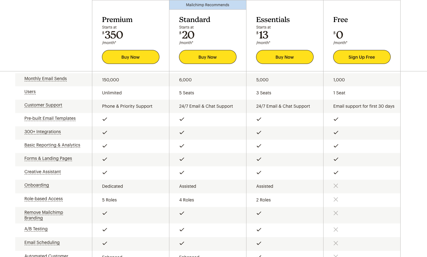
- Create a comparison table: This is essentially one big table with divided columns for each plan. On the far left (typically), you’ll have the features listed while the columns under each plan will entail whether or not each feature is included. It helps customers quickly compare features and prices at a glance, making it easy to select the best option. This is what Mailchimp has going on with their pricing plans:
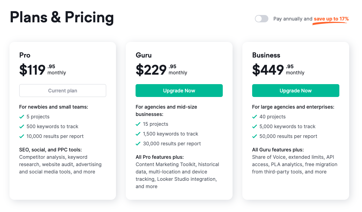
- Use pricing cards: If you want users to focus on each plan individually, then you’ll want to present plans with more pronounced boundaries – like a separate card format. Each card will typically include a headline (the name of the plan), a description, and cost. Cards are great if you want to highlight the features of each plan without overwhelming customers with too much information. SEMrush does this really well:
Don’t go over 3-4 tiered options
We know, we know. It’s tempting to offer as many pricing tiers as possible, but don’t make the mistake of going overboard. Too many plans can be confusing, cause analysis paralysis, and may even turn off potential customers.
When was the last time you saw any business offer more than four plans? It’s rare, and that’s because studies show that three to four tiers are the sweet spot when it comes to getting conversions.
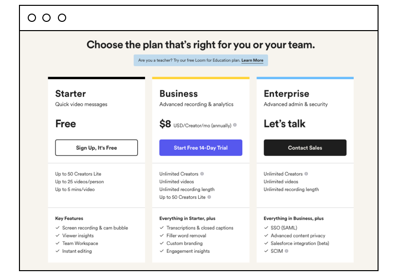
Pro tip: Instead of crowding your plans page with too many different tiers, add a “Contact Us” or “Get a quote” button as the third or fourth option. This will give customers the option to get more information if they don’t see a package that fits their needs. Loom does this on their pricing page:
Pick one tiered plan for the spotlight
As you offer more pricing tiers, it’s important to remember that one of them should stand out from the rest. This is your most popular, money-making plan, and it should be designed carefully to create a sense of urgency and get customers interested in taking the plunge.
We’re talking bold fonts, bright colors, a bigger display, and maybe even a little bit of glitter. You want that preferred tier to be impossible to miss, like a neon sign in the dark. Surfer SEO added an orange/pink gradient that matches their brand colors and made the “PRO” card stick out from the rest in size and with the label “Most Popular.”
Use clear names for your products or services
Good naming conventions are essential for understanding pricing tiers. At a glance, customers should be able to easily distinguish between each plan – and the same goes for plans within different categories, too.
When in doubt, keep it simple: use words that clearly describe the value of each offering like “Basic,” “Premium,” and “Ultimate.” But remember that the best product/service titles follow these practices:
- Get in your customer’s head: Know your target customer and what they want. Name your tiers in a way that speaks to their desires.
- Address their goals: Your tier names should focus on the benefits customers want – time, money, or effort saved.
- Keep it simple: Don’t use fancy terms or confuse customers. Keep your tier names straightforward.
- Connect to your product: Use names that evoke your product’s essence – speed, quality, or innovation.
- Be unique: Stand out by being creative and memorable. Don’t just copy your competitors.
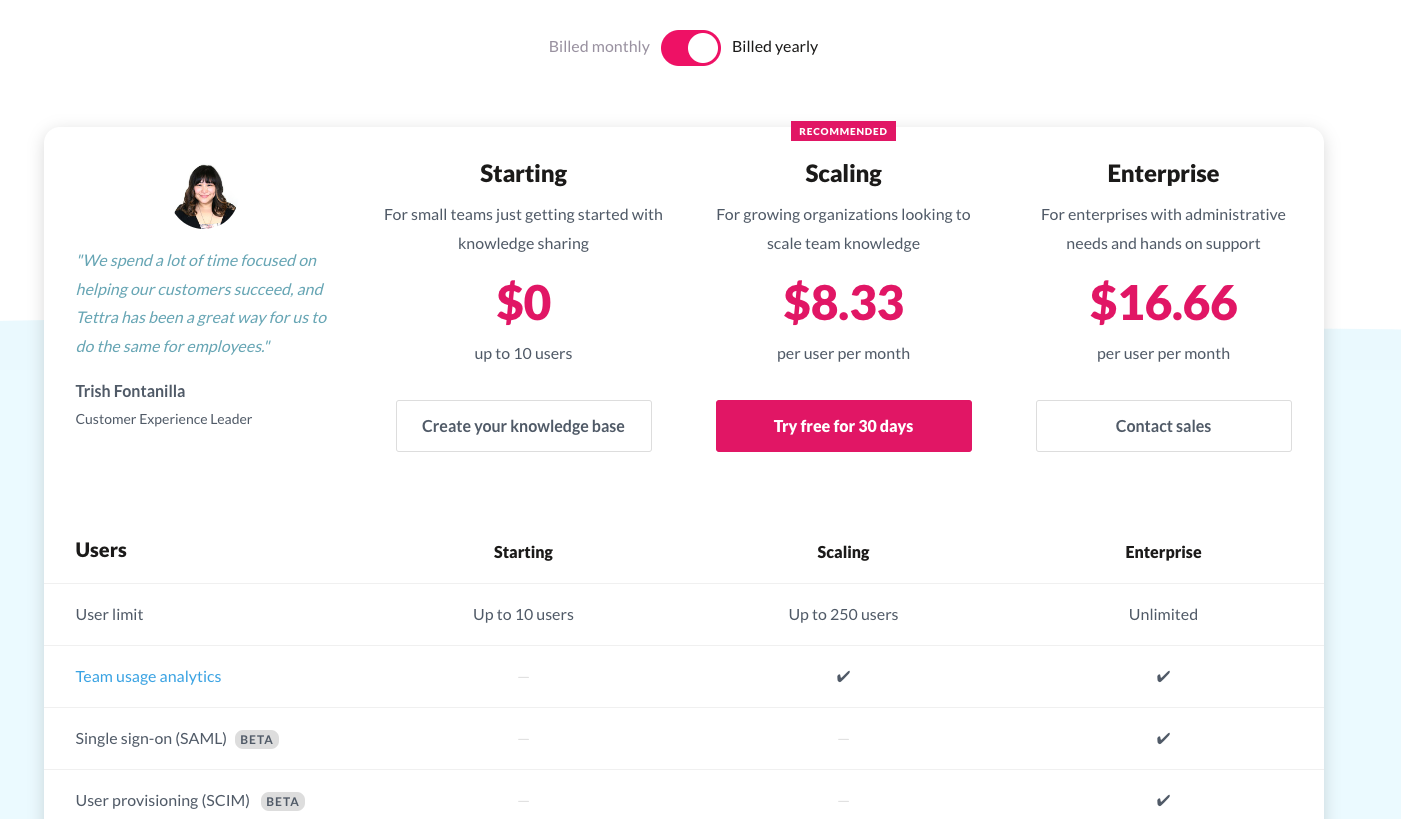
Take a glance at Tettra as an example – they labeled their tiered plans based on where a business is currently in its life cycle.
Avoid overwhelming users with too many features in each plan
Many businesses make the mistake of listing too many features in each plan. This can be confusing and lead customers to feel overwhelmed when trying to choose a plan. You only want to make the most important features prominent, while leaving the rest for a more in-depth drop-down or diagram below, a separate page, or your onboarding sequence.
In other words, focus on the basics so customers will quickly understand the value of each plan. If they have questions about more details, they can click through to learn more about them on another page.
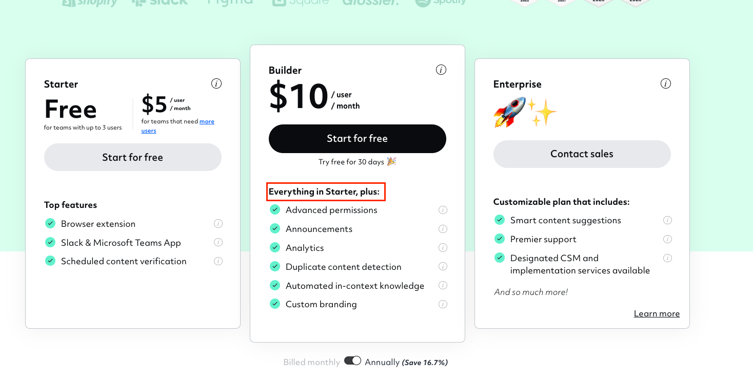
Pro tip: You can save a lot of space by not repeating the same features offered in a lower tier plan, and instead adding a phrase like “Everything in the Starter plan, plus:…”
Make one plan more appealing with a price anchor
Smart price anchoring is a pricing strategy that involves setting one product or service at a higher price point (the decoy), in order to make the other options seem like a better deal.
The key is to make sure your anchor product is still a viable option for customers who want the best of the best. Don’t make it so outlandishly expensive that nobody would ever consider buying it. But by positioning it as the premium option, you can make your other offerings seem like a steal.
Reduce the friction for the buyer
When a buyer’s at your price page, there are many things going on in their mind.
Can they trust you? What if they don’t like the product? What if they’re a bit confused about how it works? Or maybe they’re questioning if you’re legit. All of these doubts can add up to unwanted friction, and that’s why you need to make sure your pricing page is as user-friendly as possible.
Here are some tips on reducing buyer friction points and making the buying process smoother for your prospects:
- Prominently display your money-back guarantee and/or free trial to ease the fear of buyer’s remorse. Alternatively, you may want to add a paid trial which allows users to try your product or service for less.
- Address other objections your prospects may have, such as:
- Whether you have the licenses, certifications, or accreditations they expect.
- Whether your product or service is secure.
- What other customers or influential people think of your offering.
- How you compare to your competitors.
- Include frequently asked questions (FAQs) on your page. Dig through your emails or contact form submissions to find the questions your prospects typically ask.
- Consider adding a live chat feature to your site so you can answer any unique questions in real time.
- Add testimonials and reviews – if possible, embed a badge from TrustPilot or a similar site for some extra credibility.
By anticipating and addressing these friction points, you can make the buying process smoother and increase the chances of converting your prospects into happy, paying customers.
Master the art of pricing tables with GetPaid
Designing a high-converting pricing table takes more than just choosing a color and layout. It requires understanding your customers’ needs, addressing their objections and friction points, and guiding them toward the option that’s best for them.
By incorporating the tips we’ve shared in this post with a plugin like Responsive Pricing Table and the leading WordPress Payment Plugin GetPaid, which are perfectly compatible, you can create a pricing table that not only looks great but also performs well.
Your pricing page is a key element in turning prospects into customers – make sure to give it the attention it deserves!